Jan 17, 2021
Beautify your Power Apps with SVGs
Beautify your Power Apps with SVGs
By using Power Apps, companies can easily create apps that quickly offer huge value to their users. But this speed often leads to UX becoming an afterthought. This also includes a modern design that motivates employees to use the app.
There are many exciting examples of successful app design on Dribbble and I like to be inspired by them: Popular Product-design shots on Dribbble

Transparency, acrylic effects, color gradients and shadows are some of the stylistic elements that are often used. But how can these techniques also be used in Power Apps? Acrylics, gradients and shadows are unfortunately not easy to configure.
Fortunately, we can also use SVG code as an image source, and this makes it relatively easy to create arbitrary shapes and effects. I stumbled across a YouTube video by Shane Young who explains this technique very well: Power Apps SVG make your apps prettier and easier to use.
I wondered if it could be used to implement the effects mentioned above, and indeed SVG supports a whole range of effects, such as blur, clipping, etc.: Filter Effects – SVG 1.1 (Second Edition) (w3.org)
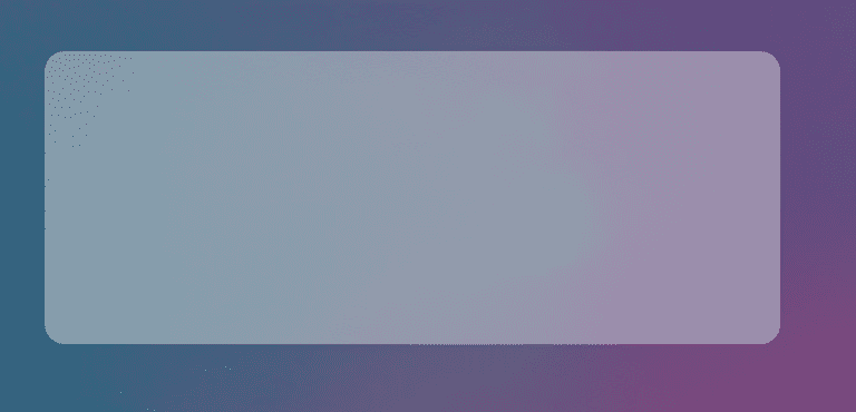
The implementation is simple: for example, for a rectangle with rounded corners and shadows, we use two identical rectangles, with the second one additionally assigned the shadow filter:
<svg width='100%' height='100%' version='1.1'>
    <defs>
        <filter id='shadow'>
            <feGaussianBlur stdDeviation='2'/>
            <feComposite operator='out' in2='SourceGraphic'/>
        </filter>
    </defs>
    <rect x='8' y='8' width='500' height='200' fill='#f0f0f0'
        rx='14' ry='14'  opacity='0.4' />
    <rect filter='url(#shadow)' x='8' y='8' width='500'
        height='200' fill='#000' rx='14' ry='14'  opacity='0.2' />
</svg>
The parameters for transparency, size and color can of course be varied as desired and this is how it could look in the app:

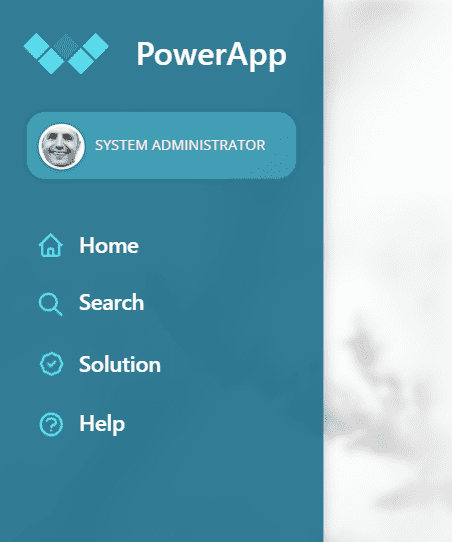
This can also be used for a side menu bar, for example. Even if I used the shadow very subtle, the appearance improves quite significantly. Implementation example:

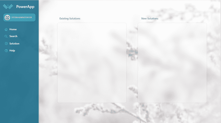
I tried a few more techniques, including how to create an acrylic effect where the background shines through very blurry and I very like it:

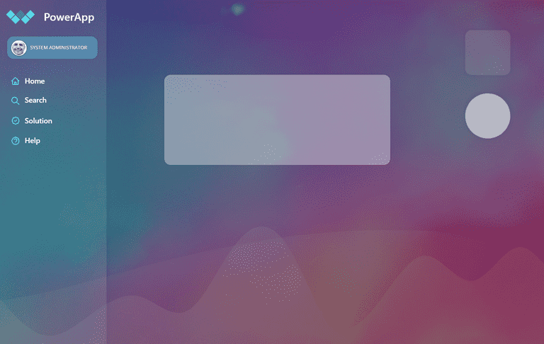
In a second example I worked with a color intensive background and additionally experimented with Get Waves – Create SVG waves for your next design.

If you want to try it yourself, please download my sample app here: Download Sample Power App. How do you like it? Please let me know in the comments on LinkedIn or Twitter.
Recommended resources and articles